Thursday 11 March 2010

Bioshock 1950's Art

After sitting and watching my housemate's boyfriend play Bioshock 2 for many hours, which was thoroughly enjoyable, and even moreso when he turned up having bought the Art and concept book that comes with it. Because the game is set in the 1950's era, a lot of the trashed posters and artwork around the game is very 50s themed and here are some examples of the imagery found in the game.

I find 1950s advertisements and imagery fascinating, I just think it was a really great era for design. yes we look at it these days and think, wow, that's really cheesey, but it worked for the era and it's really interesting to look at. I also loved that nobody gave a damn about political correctness, and the man was definitely still superior in this era, and it's reflected in a lot of 1950's advertisements. A woman's place was the kitchen. Just watch Mad Men!


-HJ x

Studio on Fire

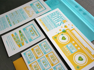
While looking up letterpress design because I really really want to have a go with it, I discovered this design agency called Studio on Fire who specialize in print design and letter press. And it's glorious. They are based in Minneapolis, which is a bit too far away for me to get all excited about. I really love what I've seen of their work and here are a few samples.


-HJ x

Typography Classics Covers


I found these while I was mooching around on ffffound.com, Typography based covers for classic novels. Here is the webpage that I found them on.

'Penguin has collaborated with AIDS awareness fund (RED) and a team of designers to produce new covers for eight Penguin Classics. Each cover replaces the usual black band with red, employing a quote from the text of the book as the visual hit'

-HJ x

Wednesday 10 March 2010

LCAD Successes!

Look what I found in the back of my Computer Arts magazine: KYLE BIBBY. Newly graduated students from my uni already in magazines, good job! A mention of Merlin Mason too.

I'm feeling an odd sense of pride for my university right now.

-HJ x