Wednesday, 29 September 2010
Sustaiable Design: Stanley Honey
This is one of the best pieces of sustainable design that I've come across so far. Honey in a plant pot, you grow a plant in the plant pot when you're done for a flower for the bees to make more honey! Clever, clever.
it's so simple and re-usable and just....smart.
Cumulus Inc.
Designed by round. for a cafe in Melbourne, Australia. The range of stationary, packaging and signage is an eco-friendly alternative to most found in other cafes. The brown paper and single colour prints is very effective and it works across a range of media. The illustration is detailed but the idea is simple and effective.
Otarian
Designed by Pearlfisher. A new sustainable restaurant chain with restaurants in New York and London so far. Complete lack of plastic in the design, just paper/card so it's 100% recycled and recyclable. Not everything fits into pillow boxes though.
Meringue & Gail's Artisan Bakery
Meringue is an upscale dessert boutique and that much is easy to see from the first picture. It's very clean and white and the closure of the box looks like a dessert in itself. The white and the single colour for each product is very simple and effective. Even the logo in itself is very whimsical while being very clean and simple. All in all? I really like it. I don;t know what those things in the boxes are though. Never seen those before in my life. Designed by Samira Khoshnood. 'Seeking to capture the airy whipped quality of meringue.'
Packaging for Gail's Artisan Bakery designed by Here. It's excellent use of single colour plus stuck, which for starters brings printing costs down. It's very eye catching and the pattern seems to be different on every thing or at least there seems to be a variety of designs available.
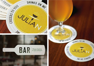
Julian's Restaurant & Bar
Designed by Jordan Gray Creative. I really love this piece of work and have done for a while. not sure why I haven't blogged about it before but there's no time like the present! It's so simple, using plain type and icons, with a little spoon for the 'i' in Julian. It made me realise that there's a lot of media to consider. It goes beyond business cards and paper bags. I have to consider window displays, staff uniforms, t-shirts? aprons? This piece of design is very inspiring to me.
Botanical Bakery & Pure Bake Shop
Designed by DBD International. Botanical Bakery is a nice little range of cookies designed with colours to indicate each flavour. everything is drawn drawn and the logo is a leaf contorted into a smile. It's got a very whimsical feel about it, it seems very playful and the bright colours catch the eye. Cookies in themselves are a treat and while are enjoyed by all ages are quite a 'childlike' thing in general.
Designed by Michael Gump Jr.
“Pure Bake Shop is a Toledo based bakery that specializes in gluten free products. The bakery uses all natural ingredients including organic beans, soy, and nut flours for their baked goods. I wanted to accentuate the “purity” of the bakeshop. The mixture of large, but thin typography, and dot patterns along with the soft vellum packaging create a mood that encompasses the pure aspect on which the bakeshop takes pride.”
This design is very aesthetically pleasing, very simple with a limited, muted colour pallet. It certainly gives off the impression of 'pure' that they were aiming for.
Pan Pan
Designed by RocĂo Martinavarro.
PanPan is an artisan bakery in Valencia, Spain. I like their visual identity using bread-like, very warm colours. The pattern reminds me greatly of the woven baskets that bread used to be carried around in. It gives it a modern take on a traditional feel.
Coup de Soup
Designed by Peter Urban.
Really nice concept work for a nice little baker/soup shop. I really like the way that the pattern is applied in a single colour across a range of media to create a different identity for each product. the hand drawn type is very cute and whimsical as well, giving it a very down to earth look
Monday, 27 September 2010
Time for Tea: Initial research
This was designed by Pearlfisher.
I quite like the rebrand of this tea product. It's very clean and simple with the white stock and black typography but the unusual and brightly coloured illustrations really draw the eye to them and give each product in the range an identity to itself, even if the image has nothing to do with tea at all.
This design for London tea was created by Cowan London. It's definitely a step away from stereotypical tea packaging. I do like the L and the T make the chair and table, but i'm not a fan of the design over all. It doesn't work for me and they don't really look all that modern and these flourishes seen on the boxes have been seen a LOT in design lately. This design looks cheap while London Tea as a brand really isn't.
Another design from Pearlfisher for Fortnum and Mason. Generally, Fortnum and Mason is a very expensive brand and these certainly look the part. Cheap to produce? Not at all. Could be seen on super market shelves? Don't make me laugh, but there's something about them. They're collectible, at least to me, and the embossing draws me in to be touched. They look elegant and expensive and very high end.
A design by Brand Engine. it's very clean, simple, and balanced but it has a sort of vintage feel about it. To look at it, I wouldn't connect to to tea in the slightest but it will stand out on the shelf with it's use of bold, bright colours.
I know this is coffee and not tea, but still. Designed by Young & Laramore Advertising. I particularly like the substrait. I know that coffee granules are loose and have to be packaged differently to tea bags but still, it's a bag rather than a box and it's nice. The type resolution works really well too.
Designed by LA+B: Love for Art & Business. Again, it's not tea bags but it's a form of tea so I supposed that I should have a look at it. Not that I'm going to be making anything like this. I've never actually had green tea, I suppose I should try it some time. The design looks very simple with bright colours for each flavour of product and looks very Asian which I suppose is the look that they were going for. It's very simplistic and effective.
Butterbeer: Our bottle collection.
So we have a growing collection of beer bottles along the top of our kitchen cabinets and these are just a few of the ones that I found the most interesting and useful to me.
These ones I suppose are quite useful with the fantastical characters each bottle represents and the use of illustration to personify each brand. I don't want to go down the illustration route in my butterbeer project though, I want to keep a limited colour pallet.
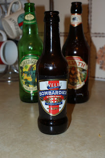
They do have this nifty little feature on all of the bottles though which is a witch on a broom embossed on the glass. not cheap to produce I imagine but a very nice touch and hey, that links right in with Harry Potter.
Well this one couldn't get more British, could it? It's also not a label, the design is part of the glass bottle itself. which is expensive to produce but is a very nice touch.
This one is American that was sent to my housemate from her friend in Texas. Root Beer is very weird, and non-alcoholic. This one also has a raised design on the glass bottle itself above the label but the light in this photograph doesn't make it show up at all. it's the Stewart's logo going all the way around the glass.
I'm not sure where this one came from but again it's personified into the pirate. This one was in my housemate's bedroom so I'm thinking that it came from her mate in America again but then I could be wrong. Probably am. Personifying the bottle is something that I'm going to have to look into but as said before, I'm not an illustrator.
This one is much more simple than some of the others in this post though it does have it's little illustration of barrels of beer faded into the bottom of the label. The subtly coloured label and the nice use of typography gives it a bit of a higher end sort of feel.
Subscribe to:
Posts (Atom)