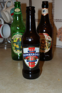
These ones I suppose are quite useful with the fantastical characters each bottle represents and the use of illustration to personify each brand. I don't want to go down the illustration route in my butterbeer project though, I want to keep a limited colour pallet.
 They do have this nifty little feature on all of the bottles though which is a witch on a broom embossed on the glass. not cheap to produce I imagine but a very nice touch and hey, that links right in with Harry Potter.
 Well this one couldn't get more British, could it? It's also not a label, the design is part of the glass bottle itself. which is expensive to produce but is a very nice touch.
 This one is American that was sent to my housemate from her friend in Texas. Root Beer is very weird, and non-alcoholic. This one also has a raised design on the glass bottle itself above the label but the light in this photograph doesn't make it show up at all. it's the Stewart's logo going all the way around the glass.
 I'm not sure where this one came from but again it's personified into the pirate. This one was in my housemate's bedroom so I'm thinking that it came from her mate in America again but then I could be wrong. Probably am. Personifying the bottle is something that I'm going to have to look into but as said before, I'm not an illustrator.
This one is much more simple than some of the others in this post though it does have it's little illustration of barrels of beer faded into the bottom of the label. The subtly coloured label and the nice use of typography gives it a bit of a higher end sort of feel.

No comments:
Post a Comment