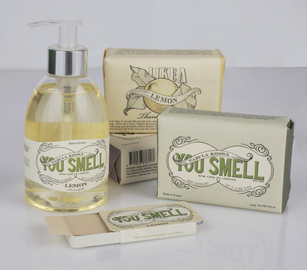
I think this is really clever the way it's been done, using their own products to represent others.


 Designed by Studio Plastac. This is quite a nice idea of sustainability in the way that the packaging is turned into something else rather than just thrown away. While it doesn't serve another purpose in it's second form, it is kept rather than just thrown away.
 This arrived in my inbox this morning, which is actually pretty handy to see a shop not unlike The Body Shop getting their Christmas spirit on. They haven't actually used the Lush logo at all in their Christmas branding which throws me off a little bit but Lush is an adjective as well as a brand name. and it just doesn't look like it belongs to the company. Also, they use a lot of bright colours in their design and I don't really think that the old style that they've used really fits in with their aesthetic.
 This is a screencap of their Christmas range of gifts on the website. The side banner is more brightly coloured and looks a little bit more 'Lush' moreso than the image that I got in my email.

 I think that this piece of design kind of applies to several of the briefs that I'm working on so I thought I'd stick it up. I love this piece of design, designed by Ah&Oh Studio, it's so simple but I really like it. The hand drawn type is very whimsical, as is the colour scheme. The black bands on the jars represent the bee without there even needing to be a bee reference. I don't even like honey but I want it. It looks quite expensive and high quality. I also like the lack of information printed on the jar to keep it minimal.


 From here.
 Kelvin Farrell & Jason Cartwright